
How to Incorporate Variety into Photography
Learn about the 6th Principal of Art- Variety. I’ll cover how to use variety with the 7 elements of design, and finish the video with a discussion on the Rule of Odds.
Prefer to watch this tutorial in video format? 😏
Introduction to Variety
In this tutorial, I'm going to walk you through the sixth Principle of Art, which is variety. Variety is a fickle mistress because it’s a rather vague term. Essentially it’s referring to the amount of elements in your photo, and how they should balance each other out.
If you have too much variety in a shot, it will look overwhelming to the viewer and fail to provide a stabilized image. On the other hand, if you have too little variety, the shot will look stale and boring. You want just the right amount of varied elements in a shot to make it pop.
In order to cover this principle properly, I’m going to walk you through seven different examples of variety using the seven Elements of Design we've covered in this course. Then, at the end of this tutorial, I’m going to talk about the rule of odds.
Let’s jump right in!
Types of Variety
Variety of Lines
The first example I want to show you is a variety of lines. This means incorporating horizontal, vertical, and diagonal lines, as well as different textures of lines, to create a diverse set of lines within a shot. Check out this image right here:

This image, demonstrating a variety of lines, was taken at Las Coloradas in Mexico.
As you can see, we have organic lines from the plant contrasting with the dried outlines in the sand. These lines go in all sorts of directions, almost spider-like in nature. By including these varied lines, we're making the shot far more interesting than if it were just a shot of the roots, or if all the lines were going in the same direction.
Variety of Shapes
Now let’s check out how variety can be applied to shapes. How can we incorporate different shapes in a shot to make it stand out? Here's an example image:

This photo, which utilizes a variety of shapes, was taken at Bombay Beach in southern California.
As you can see, we have a circular tire in the front, a wooden ship in the back that has an almost triangular shape, and, in the right corner below the ship, a wooden rectangular sign. Now we have three different shapes in the shot that contrast with each other. Additionally, the tire's rubber structure contrasts with the wooden structure of the ship, adding another layer of variety to the shot through texture.
Variety of Form
Variety of form is next on the list. If you recall, form is how we make something look 3D or dimensional in a shot, and there are various techniques to achieve this. Check out this image of some roots at a cenote in Guatemala:

This photo of roots, which demonstrates at variety of form, was taken at Cenote de Candelaria in Guatemala.
We have nice shadows and highlights from the side lighting that help build out those roots. They almost feel like they're coming out at you. We also have diagonals to give the scene depth, and there's a bit of depth of field in this shot. I believe I focus-stacked the roots, and if you look in the background, you can see a water source that's slightly blurred to provide context for the roots. All these different types of form come together to make this shot pop.
Variety of Color
The next example of variety is through the use of color, which is fairly obvious. Simply look for a larger palette of colors to incorporate into your image. Check out this shot of a maple tree in Oregon:

This photo, which demonstrates a variety of colors, was taken at the Japanese Garden in Portland, Oregon.
As you can see, we have many different colors in this shot, which is why this tree looks so interesting compared to, say, a plain green tree. It’s not often you see this many colors in nature, so when you see a scene like this, figure out how to make it work.
Here’s a fun fact- that tree is actually only about 2 feet tall in real life- I used an ultra-wide angle lens from below to make it appear bigger.
Variety of Texture
Now let’s look at how to use a variety of textures. How can we make different parts of the image feel distinct to the viewer? Check out this drone shot from above, where I'm lying on the ground:
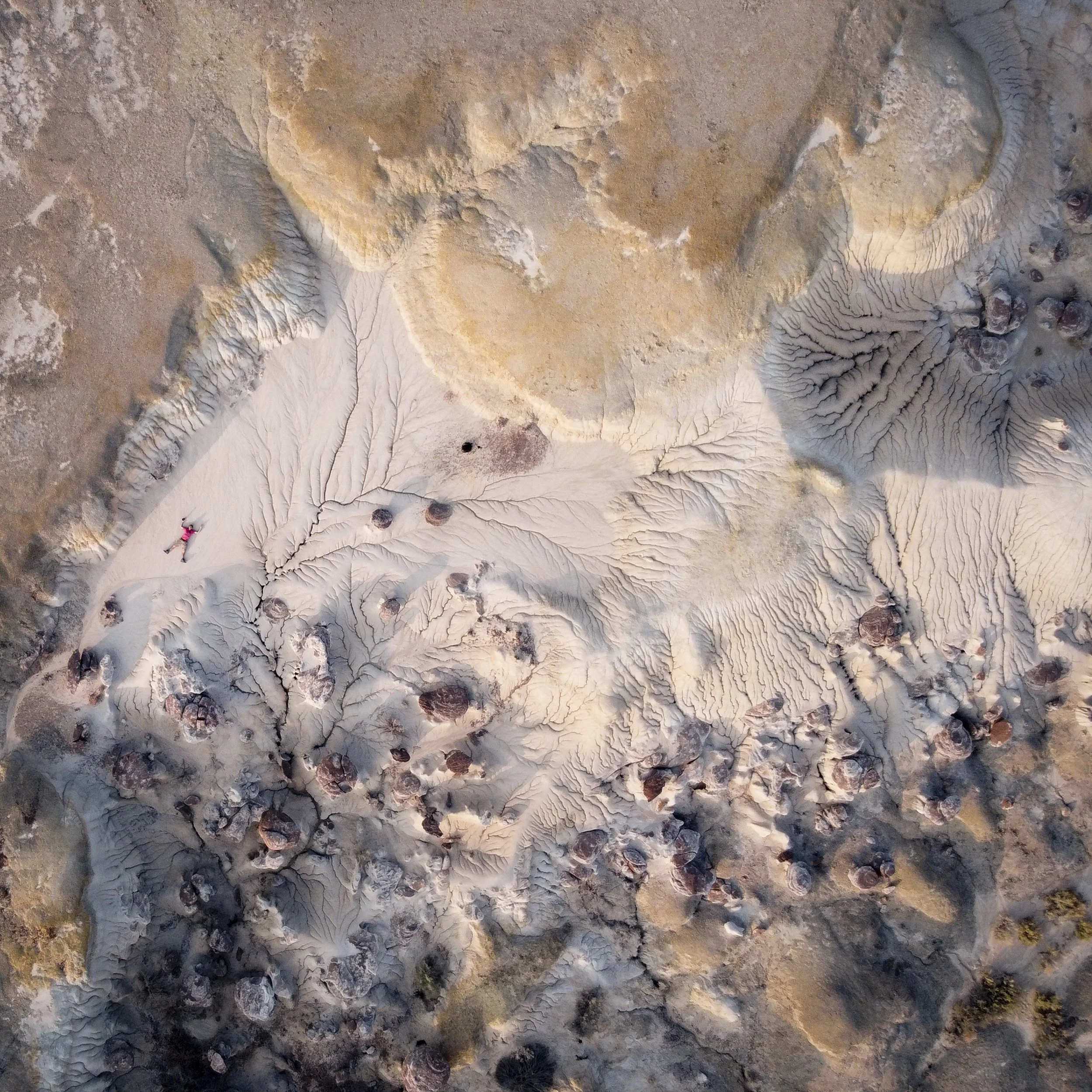
This image that contains a massive amount of different textures, was taken at the Ah-shi-sle-pah Wilderness in New Mexico.
We have three main types of textures: the crackly ground, the yellowish smooth texture at the top of the image, and the purplish-pinkish rocks with a straggly texture. These three textures add variety to the shot.
Variety of Value
Using a variety of values in an image is also fairly obvious, as it simply refers to using a large spectrum of light and dark tones. Check out this simple image consisting of just three elements:

This image, which contains a variety of different values, was taken at Ruby Beach in Washington.
There’s two rock structures and a person off to the right. The two rock structures have slightly different values, which gives the shot it’s depth.
Variety of Space
Finally, I want to show you a variety of space, which can be one of the trickier elements to work with. In this double-exposure shot, I masked myself out of one of the images, so it looks like I'm standing only in the negative space of the shot:

This photo incorporating both positive, negative, and every type of space in-between, was taken at Elephant Rocks in Missouri.
While we use that negative space, we also have positive space on the rock around it, creating a wide variety of spaces that you don't see in an everyday photo.
Alright! Those are all the different elements of design used with varying levels of variety. If you can find ways to combine and mix and match them, you can create even more powerful shots. Don’t be afraid to get creative and take risks!
The Rule of Odds
Now, let's end this tutorial by talking about the rule of odds, which is quite straightforward but a gamechanger for your photography. It essentially means that if you have multiple elements counted in your shot, try to include them in odd numbers.
For example, if you have birds, aim for three birds instead of four:

This photo, featuring three birds, was taken at Point Lobos in California.
If you have trees illuminated from the side, try to have three instead of two:

This photo, featuring three trees, was taken at Fern Canyon in California.
There's a lot of psychology about why odd numbers are more interesting to the eye, (hint, it has to do with the lack of symmetry which adds drama,) but the key lesson here is to use odd numbers when possible as a simple way to add interest to your shots.
A Brief Conclusion to Variety
That's everything you need to know about variety, a fairly simple principle of art. Finding ways to balance it effectively with the various Elements of Design can really make your art stand out. Let's go ahead and move on to the next tutorial, where I’m going to talk about Harmony.