
Steal These Color Tricks to Make Your Photos POP
Learn about the fourth Element of Design- Color. I’ll cover what color is made of, the color orders, the five main color schemes, and about the psychology behind different colors.
Prefer to watch this tutorial in video format? 😏
Introduction to Color
In this tutorial, I'm going to walk you through the fourth Element of Design, which is color.
Now, let me give you a fair warning here, color can get a bit complicated. There's a lot of math, science, and theory behind it. But in this tutorial, I'm just going to walk you through exactly what you need to know to implement it effectively in your photography. None of the extra stuff.
I'm going to start by going over what color is and what it's made up of. Then, I'm going to dive into the orders of color- AKA the primary, secondary, and tertiary colors. Next, I’ll walk you through the five main color schemes you're going to see in the photography world. Finally, I’m going to talk about the psychological and emotional connections people associate with different colors.
Let’s dive in!
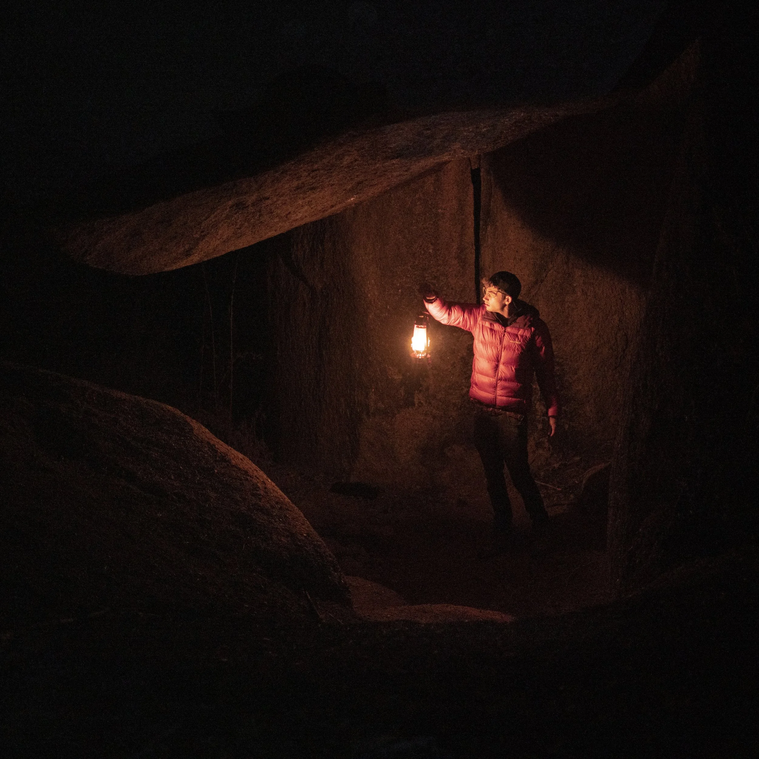
This photo, taken off Mt. Herman Road in Colorado, uses red and black to convey mystery.
What Is Color?
First off, color itself is made up of three different components: hue, saturation, and value.
Hue is essentially where the color lies on the color wheel. This means it can be green, purple, pink, yellow, blue, or any unique color in-between.
Saturation, on the other hand, begins to take intensity into account. AKA, how full or vivid is the color? Something that's extremely desaturated won't have much color in it, and would appear more gray, or black and white if it’s completely desaturated.
The third component is value. If you remember back to the Elements of Design, value is actually an entire element on its own, but I’ll be covering that in more detail in the next tutorial. For now, just know that value refers to how much white and how much black is present within a color. It’s essentially the luminosity (or brightness) of that color.
These three components, hue, saturation, and value combine to make up what we understand as color.
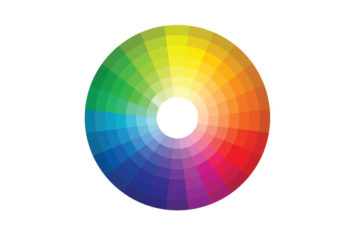
This is a color wheel, which displays the hues of colors as you rotate in the circle, and the saturation/value of the color as you get closer to the center.
The Order of Colors
There are a lot of different theories out there about how to properly order colors. In this course, we're going to work with the RGB model, which is what most photographers use. It's best for screens and will be directly applicable to your editing process.
RGB stands for red, green, and blue, which are the three primary colors. If you mix all three of these colors together in even proportions, you get pure white. All colors in the spectrum can be formed with a different combination of these three colors.
Secondary colors, on the other hand, are created by mixing two of the three primary colors:
Red + Green = Yellow
Green + Blue = Cyan
Red + Blue = Magenta
Tertiary colors are formed by mixing a primary color with a secondary color:
Red + Yellow = Orange
Blue + Magenta = Violet
And so on…
Color Schemes
Color schemes are essentially ways of combining certain colors that are naturally pleasing to the eye. These are combinations of colors you’ll want to look for when you’re out shooting. There are five main color schemes to keep an eye on:
Monochromatic
A monochromatic color scheme uses only one color, but in various values and saturations.
For example, check out this shot right here:

This photo, representing a monochromatic color scheme, was taken at Dog Slaughter Falls in Tennessee.
The only color in the scene is green. But the key here is that there are light greens, dark greens, and various hues of green. Monochromatic images are simple, but they can be strong when utilized correctly.
Analogous
Analogous color schemes use two or three colors that sit next to each other on the color wheel. This means the colors are all similar.
For example, this portrait here includes pink, purple, and a hint of blue:

This photo, representing an analogous color scheme, was taken at Teatro La Paz in Mexico.
Typically one color dominates, while the other(s) trail off in different directions on the color wheel. This maintains a central harmony in the image, while introducing a subtle variation.
Complementary
Complementary colors are opposites on the color wheel. They contrast each other and make images pop. They also feel balanced to the human eye, for scientific reasons that are beyond the scope of this tutorial. Just know they do.
For example, one of the most common combos in photography is orange and blue, like in this shot of a shipwreck at sunset with a blue ocean:
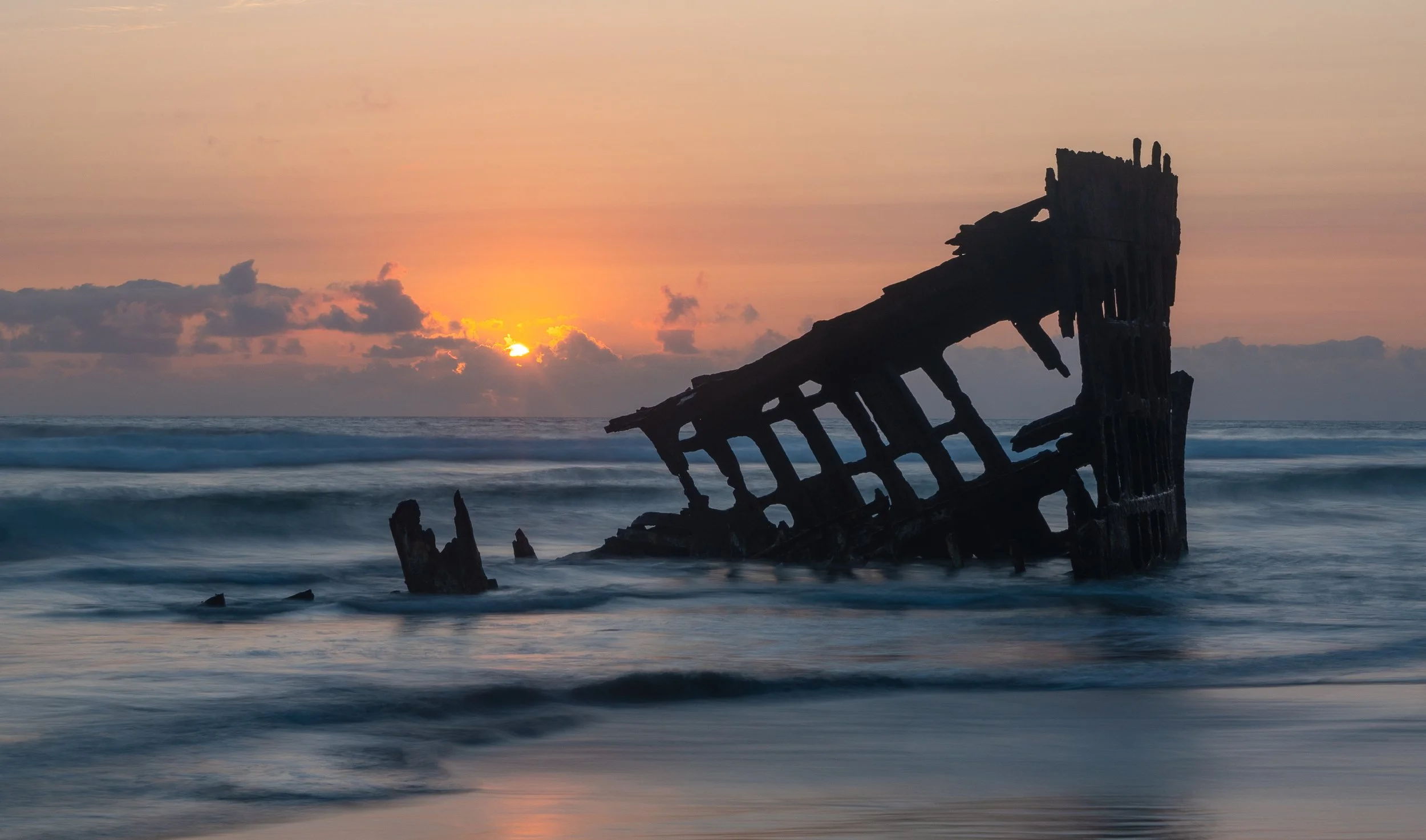
This photo, representing a complimentary color scheme, was taken at the Wreck of the Peter Iredale in Oregon.
Another popular combination is red and green, like Christmas colors:

This photo, taken at Fall Creek Falls in Tennessee, utilizes a red and green complimentary color scheme.
You’ll also see yellow and purple sometimes, which can be found in flowers or portraits.

This photo, taken at Big Bend State Park in Texas, utilizes a purple and yellow comlimentary color scheme.
Split-Complementary
Split-complimentary colors are similar to complementary colors, but they have a twist. You take one color, then instead of picking its direct opposite, you choose two colors adjacent to its opposite.
For example, in this redwood forest shot, the green trees and yellow highlights form an analogous base:

This photo, taken at the Redwoods in California, utilizes a split-complementary color scheme.
But I'm also wearing a red jacket, which is the opposite of green. This gives the photo a full split-complementary balance.
Triadic
Triadic color schemes use three colors evenly spaced on the color wheel, which forms a triangle.
Take for example purple, yellow, and green. Here’s a shot that includes all those colors:

This photo, representing a triadic color scheme, was taken at Faro Punta Areanas in Mexico.
This color scheme is a bit more difficult to pull off, but if you can find it naturally or through styling, the result is very often striking to the eye.
How to Get Started with Colors
Alright. That’s a lot of information... Are you hanging in there? It’s not important to memorize it all at once- simply knowing that these schemes and orders exist goes a long way.
If you're just starting out with color theory, I’d recommend focusing on trying to find monochromatic color schemes in nature. (AKA, find one color with different hue and value variations, and get a solid shot of it.)
Then, as you build your confidence, slowly incorporate analogous (two-three similar) colors into your composition toolbox. Once you're comfortable with that, you can explore complementary, split-complementary, and triadic schemes.
Don’t overwhelm yourself too fast! Color knowledge takes time, but before long you’ll be seeing these schemes all over the place without even realizing it.
Psychological Associations of Color
Now let’s talk about the emotions and meanings people commonly associate with different colors. This will allow you to target various feelings with your photography.
Red - Passion, drive, love, energy. I wear red often as it pops and reflects my passionate approach to photography:
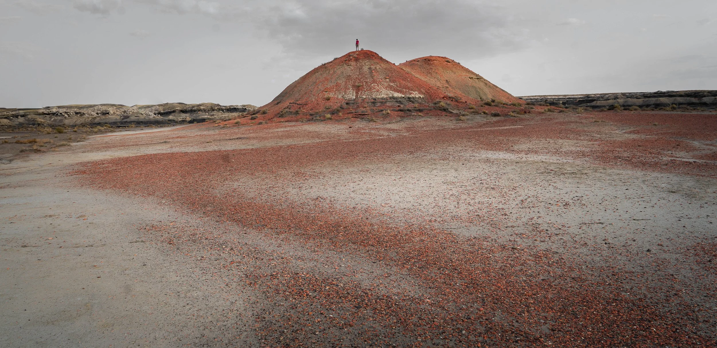
This photo, taken in the Bisti Badlands of New Mexico utilizes the color red.
Orange - Joy, enthusiasm, and power, but not as intense as red. It’s a nice step down in energy:

This, photo, taken at Badlands National Park in South Dakota, utilizes the color orange.
Yellow - Happiness and warmth, like the sun. Here’s a shot of me running through sand hills in Nebraska, surrounded by yellow tones:

This photo, taken in the Sandhills of Nebraska, utilizes yellow tones to compliment the happy, running energy of the person in the shot.
Green - Growth, nature, life. This shot in a lush forest feels like something out of a fairy tale:

This photo was taken at Martin Lake in Louisiana, utilizes the color green to demonstrate the wonder of nature.
Blue - Calm, confidence, tranquility. In this drone shot, I’m walking into the ocean in a serene moment:

This photo, taken on Padre Island, Texas, utilizes the color blue.
Purple - Wisdom, luxury, mystery. Royalty often wears purple. This church shot, colored with a purple hue, feels magical and ethereal:

This photo, taken at Independence Temple in Kansas City, utilizes the color purple to demonstrate the church’s wisdom.
Black - Mystery, darkness, power. This shot from Craters of the Moon in Idaho has volcanic, Mordor-like vibes:

This photo, taken at Craters of the Moon in Idaho, utilizes the color black.
White - Innocence, safety, purity. This drone shot of me walking through a salt field in Utah could symbolize peace and simplicity:

This photo, taken the Bonneville Salt Flats in Utah, utilizes the color white.
Now it’s important to keep in mind that everyone may associate colors differently depending on their background, but these traits are generally accepted across most cultures.
A Final Note
Color has a major influence on the feelings that come from your image. By learning how to spot color schemes in the wild and understand the psychology behind them, you can begin to create images that stand out from the crowd.
The editing process is where color becomes incredibly powerful. Sure, it’s important to find good color in-camera, but when you’re editing in post-production, you can really begin to shape it.
In Photoshop, for example, you can completely change one color to another (like turning green trees yellow to simulate autumn,) desaturate unwanted colors to let others stand out, and manually adjust the hue, luminance, and value of specific colors.
We’ll dive deeper into those techniques in the editing portion of the course.
Let’s jump into the next tutorial, where we’ll cover what Value is, compositionally speaking.