
The Power of Negative Space in Photography
Learn about the seventh Element of Design- Space. I’ll cover differences between positive/negative space, discuss how to use it, and finally what the Rule of Space is.
Prefer to watch this tutorial in video format? 😏
In this tutorial, I'm going to walk you through the seventh Element of Design, which is space. I'm going to teach you the differences between positive and negative space, walk you through how to use space, and finally, I'll go over the ultimate rule of space.
Let’s jump in.
Positive vs. Negative Space
Let's start by going over the differences between positive and negative space. Positive space is generally where the subject of your photo is. It's the centerpiece of your photo, and it’s where the eye is drawn to.
On the other hand, negative space is what supports the positive space. It's all the emptiness around the main subject of your photo, and it’s what allows the positive space to stand out.
Let me give you an example. Check out this shot right here:
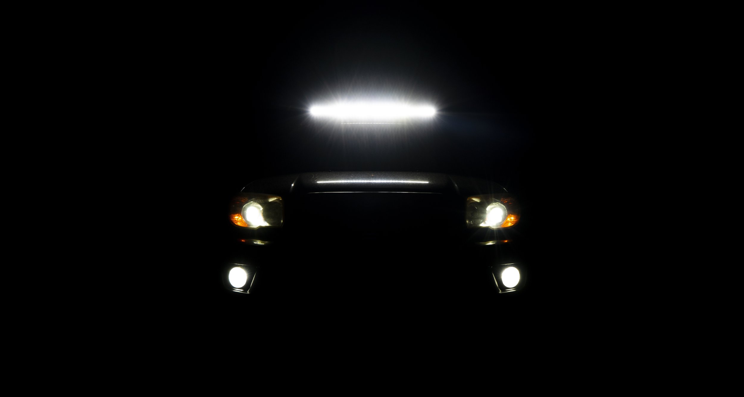
This photo of an SUV demonstrating negative space was taken on Rainbow Road in the mountains of Colorado.
This picture of an SUV with its lights on utilizes negative space very effectively. Almost the entire photo is negative space, and that blackness is used to help emphasize the positive space, which is the lights- aka the subject of the photo.
On the other side of the spectrum, check out this photo right here:
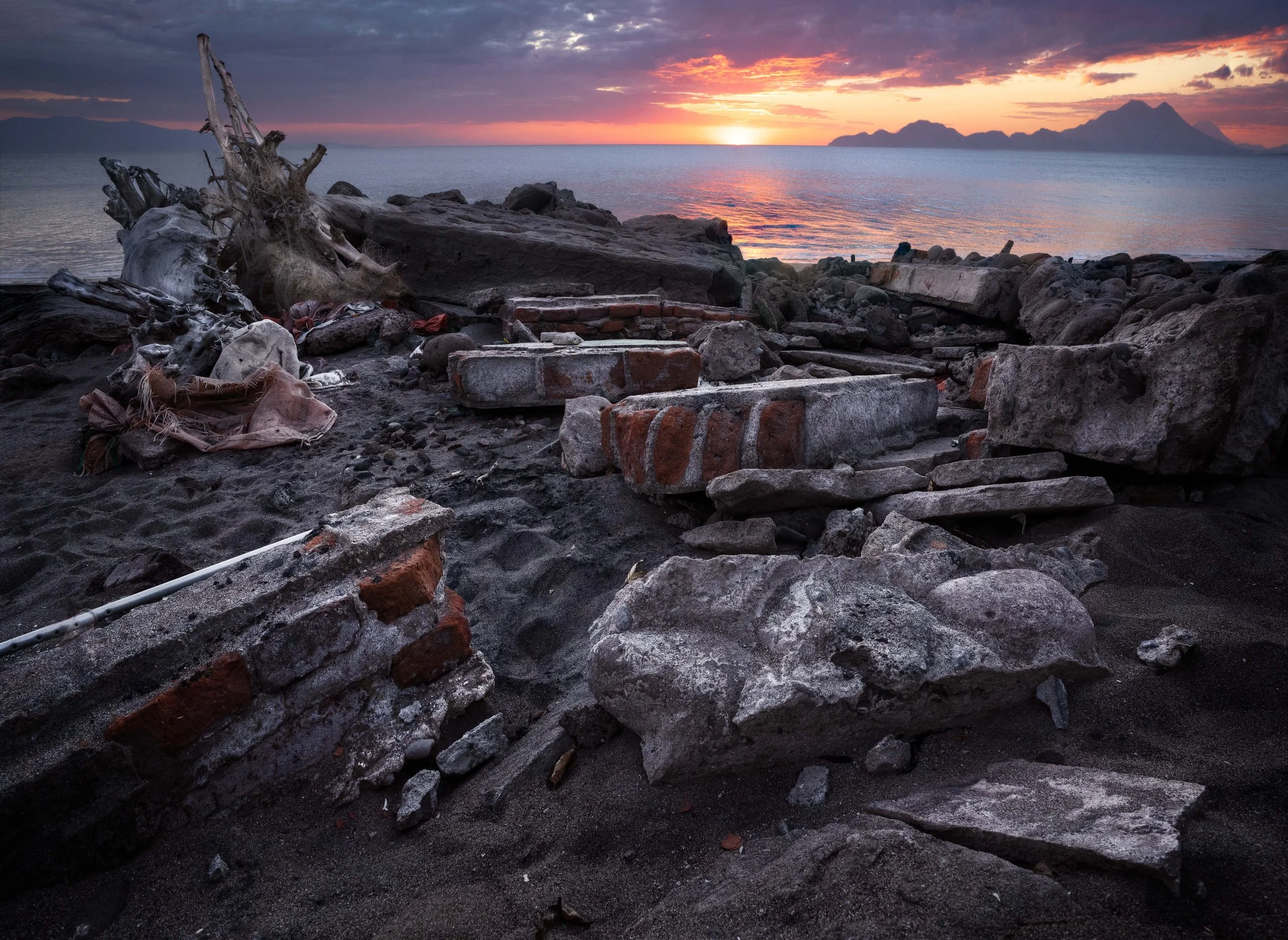
This photo, depicting the excessive use of positive space, was taken at Playa de Cedeño in Honduras.
Notice how much positive space is being used? There's not a lot of negative space, as almost every inch of this shot has something going on. That was very intentional on my part. I wanted to demonstrate how much trash was on this beach and convey the chaos of the scene.
Those are the main differences between positive and negative space. Used effectively, they can portray different messages within your photography.
How to Use Space
Now that we have the basics, let's talk about how to use space. There are four primary ways I want to go over:
1. Demonstrating Distance
The first way to use space is to demonstrate how far away something is. One way I like to do this is by cutting off the horizon. Check out this shot right here:

This photo of an endless lake of ice was taken at Chatfield State Park in Colorado.
Since the horizon isn't in the shot (it's actually just beyond the edge of the frame), I'm leaving the distance of the image up to the viewer's imagination. Now, they look at this shot and think, "Wow, this lake must go on for miles past that cutoff point." In reality, it ends right after the cutoff point. But they don’t know that. This use of space makes the scene feel bigger than it actually is.
Another example is this shot of sand hills taken in Death Valley:
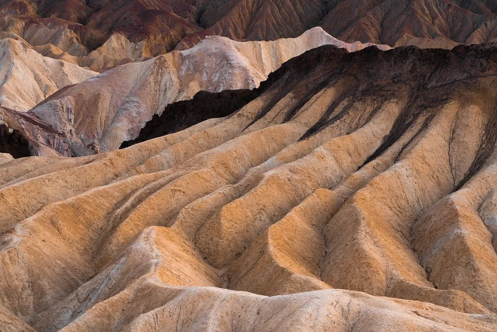
This photo, representing a cut-off horizon, was taken at Zabriskie Point in Death Valley, California.
Again, I purposely cut off the horizon to make it seem like these hills keep going forever. This is a technique I love to use to show off the vastness of a region.
2. Creating Scale
The second trick I like to use space for is to create scale. Check out this shot right here:

This photo of a seemingly massive sea cave was taken at Shark Fin Cove in California.
It's of a small sea cave on the beach I was standing on. You can see my silhouette walking through the sunlit beach, but I purposely made the top half of the image black. That was to enhance the perceived scale of the cave.
Even though the cave was only slightly taller than where the light stops in the image, including that black negative space made it feel much larger. It's all about playing with the viewer's imagination.
Another example is this wide-angle shot I took under a tree:

This photo of a volcano surrounded by massive tree branches was taken at Playa Peru in Nicaragua.
I purposely included a ton of branches in the frame so that they take up the majority of the shot. This gives the impression that the tree is massive. In reality, it wasn't that big in comparison to other trees in the area. By using a super wide angle and filling most of the frame with branches, I was able to emphasize their power and size through distortion.
3. Conveying Weight
Space can also be used to demonstrate the weight of an object. For example, take this photo from Garden of the Gods in Colorado of the famous Balanced Rock:

This photo, representing literal visual weight in an image, was taken at the Garden of the Gods in Colorado.
I shot it from an angle that makes it look like the rock could fall on me at any moment. By isolating the rock against the sky (which is full of negative space,) I was able to emphasize its mass and instability. If I had taken the shot from another angle where the rock blended into the ground portion of the background, it wouldn’t have stood out as much.
Here’s another example:

This photo of a falling leaf was taken at Minnie Mine in Breckenridge, Colorado.
If you have leaves falling from a tree and want them to look airy and weightless, give them a lot of space between other objects in the shot. This makes them stand out and feel delicate.
4. Separating Subjects
Space can also be very effective at separating subjects in your photos. This gives them more power. Essentially, breaking down images into different sections. For example, check out of this shot:
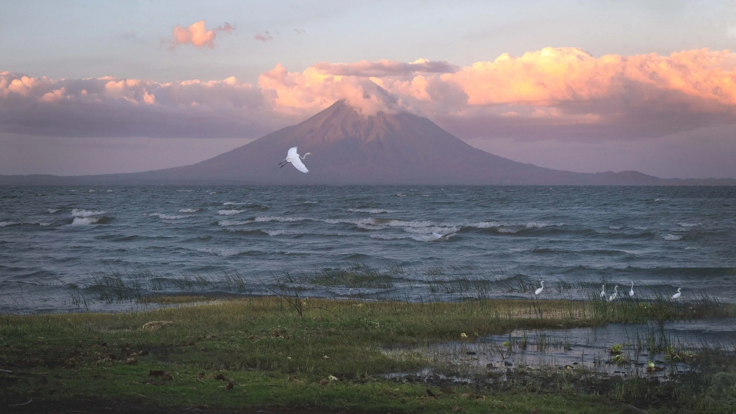
This photo of a volcano representing visual separation, was taken at Los Cocos in Nicaragua.
As you can see, there is a volcano, a bird flying perfectly within the volcano’s outline, a section of water, and then another section of grass with birds in it. None of these elements are stacked on top of each other, and they each have their own space to breathe.
I achieved this by making sure my camera was high enough to separate the water from the grass. If I had taken the shot too low, the grass would have blended with the water.
I also made sure the bird was isolated against the volcano’s surface, instead of the clouds or the waves where it would blend in. By separating different parts of your image using space, you can make elements stand out more clearly and avoid confusing the viewer.
The Rule of Space
Finally, let's talk about the rule of space. This rule states that if you have an object in your image moving in a certain direction, you should give it room to move into that direction.
For example, check out this shot of a car driving down the street:

This photo of a car driving through China Town was taken in San Francisco, California near the Palace of Fine Arts.
I made sure the car was at the bottom of the frame with plenty of road above it, so the viewer can imagine it continuing forward. This helps construct a story in the viewer’s mind. Think about it- if there’s nowhere for a subject to go, it can be difficult for a viewer to imagine it going anywhere.
Here’s another example:

This photo of a person hiking between two mountains with a long distance to go was taken on Oxford/Belford in Colorado.
Notice how the photo shows the start of the pathway, where the person is, and all the distance they still have to go. This creates a journey in the viewer’s mind for the image.
This rule applies to people, animals, and objects- anything that appears to be moving. If something is pointing or facing a certain way, make sure you include enough space for it to “move” into.
A Final Work About Space
And that, my friends, is how you can use space in your photography. Used effectively, you can begin to break your compositions into various sections that have room to breathe and come to life. I’d say one of the biggest lessons of space is learning to understand that less can be more.
To summarize this tutorial, positive space is where the subject is, while negative space is the emptiness that supports the subject. Space can be used in four primary ways- to demonstrate distance, scale, weight, and separation of subjects. Finally, the rule of space exists to remind you to give your subjects a place to go.
Let’s hop into the next tutorial, where we’re going to talk about the first Principal of Art- Balance!