
7 Unique Ways to Balance Your Photo Composition
Learn about the first Principal of Art- Balance. I’ll walk you through what Balance is, and 7 ways to use it in your photography.
Prefer to watch this tutorial in video format? 😏
Introduction to Balance
Now that we've gone through the seven Elements of Design, I’m going to spend the next couple tutorials going over the seven Principles of Art. Remember, these seven principles are all different ways to mesh together the elements (lines, shapes, etc.) we’ve been learning over the past couple tutorials.
Today, I’m going to start with the principle of balance. Balance is essentially the distribution of visual weight across your image. And by “visual weight,” I mean the elements in the shot that are the most “heavy” on the eye.
Elements like shapes, texture, or color can all have different influences on how the eye is drawn to them. An element with a lot of visual weight will draw the eye to it more quickly. What we’re striving for in this tutorial is to figure out how to balance the elements of an image to create an even visual weight.
Let’s dive in!
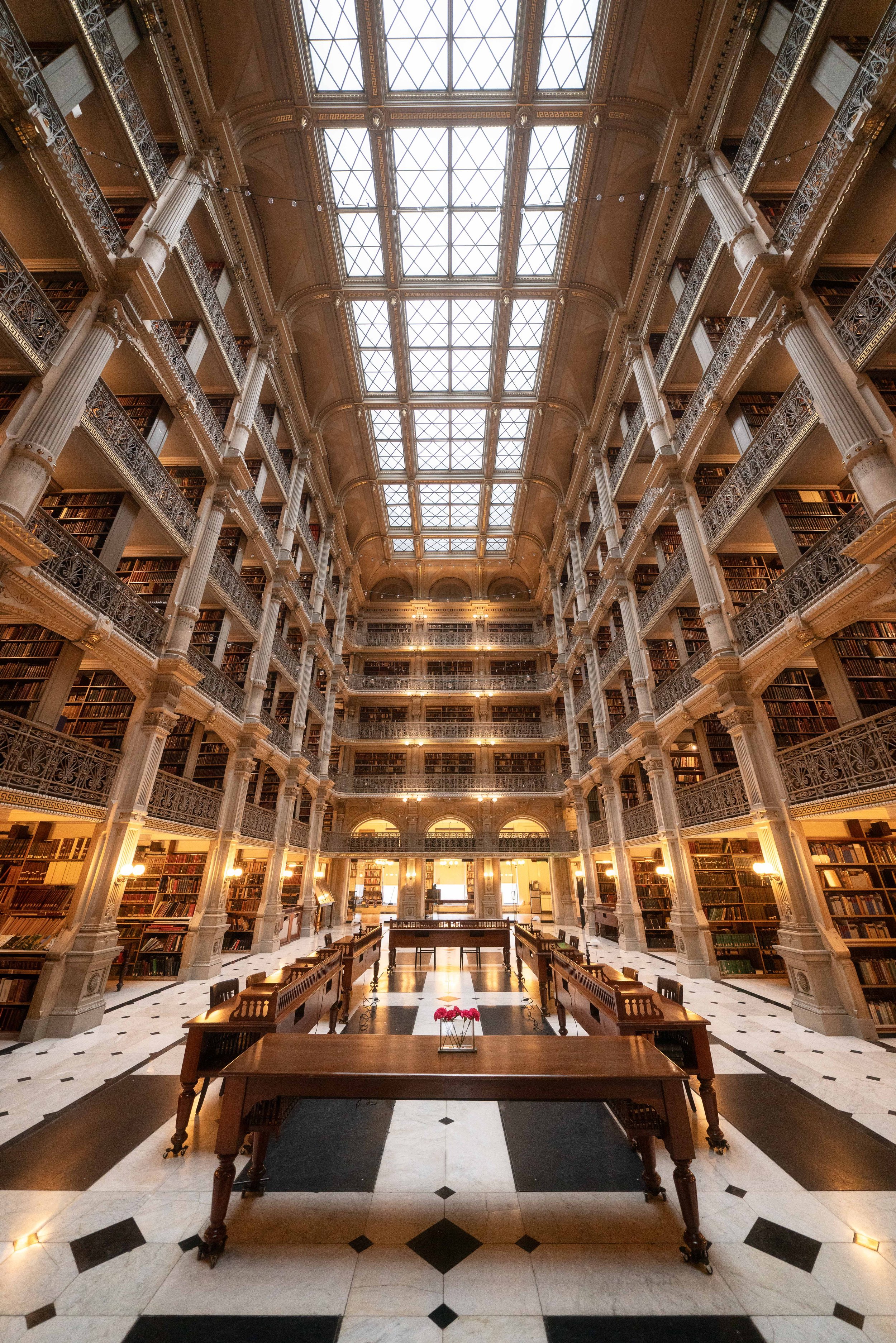
This photo of near perfect balance, was taken at the George Peabody Library in Baltimore, Maryland.
Seven Ways to Balance Your Images
Now, there’s seven primary ways to achieve balance that I use in my photography. I’m going to break down each one with examples to show how it works.
1. Symmetry
Symmetry is the first way to balance your image, and it's probably the easiest. You essentially pretend like there’s a horizontal or vertical line going through the middle of your composition, and each side is a reflection of the other. Most of the time the line will be imaginary, but in some cases it can exist in real life to make your job even easier.
There are two main situations where you’ll use this.
First, in man-made scenes. For example, if you’re inside a church you can align yourself perfectly down the middle of the aisle, you’ll have an even split of the church on both sides:

This image, representing almost perfect photo symmetry, was taken at Santuario de Nuestra Señora de Guadalupe in Mexico.
For man-made scenes, I prefer to keep my balance as precise as possible because these structures usually have symmetry built in- you just have to align your camera correctly.
A quick tip is to look at where your lens is positioned, not the camera body. Camera bodies can often be uneven, so rely on the lens to center the scene. Also, pulling up your camera’s composition grids on the screen can help you align elements with specific points across your image. Don’t forget to check the center lines too.
If you’re having a hard time getting the symmetry absolutely perfect, remember that when you get into Photoshop or Lightroom, there are tools to fix perspective and minor alignment issues. Just try to get it as close as you can.

This shot, also depicting symmetry in a man-made structure, was taken at the Vessel in New York City.
The second instance in which you’ll use symmetry is in nature scenes. However, nature makes symmetry a bit more challenging, as it’s almost never perfect or even close to it. One shortcut is to look for water. If you can find still water and get your camera close to it, you can capture symmetrical reflections. There will still be some distortion, but that’s normal and it can potentially add an abstract vibe to the image.
Another way is to keep an eye out for naturally aligned elements. For example, here’s a shot where we had trees lined up almost perfectly, with a single plant in the center. It’s not a perfect symmetry, but it has that feeling and it’s about as close as you’re gonna get in nature:

This photo, depicting symmetry in nature, was taken somewhere in the forests of Tikal in Guatemala.
2. Asymmetry
The second way to balance your image is through asymmetry. This type of balance is a bit more complex and requires a better understanding of your surrounding elements. Asymmetry means having a main subject on one side of the shot, and then secondary elements on the other side that balance it out in terms of visual weight.
For example, check out this shot:

This photo, representing an asymmetrical scene, was taken at Sentinel Dome in Yosemite National Park.
In the bottom left, there’s a giant rock jutting out. But on the top right, there’s a tree leaning out. They’re completely different objects, but since they’re both “jutting” in opposite directions, they balance each other out visually.
Here’s another example of an artistic junkyard I found in Slab City, California:

This photo of an asymmetrical “artistic junkyard” was taken somewhere in Slab City, California.
On the left, there’s a large, refrigerator-like object. On the right, there’s a tree hanging from a TV, plus a chair in the bottom right. Together, these three elements balance out the big object on the left.
With asymmetry, you’re looking for different objects that connect visually, and oftentimes you may not be able to explain why they balance. It could be their physical size, weight, or even symbolical meaning. The more you shoot, the more you’ll learn to trust your intuition in balancing different objects.
3. Radial Balance
Radial balance is similar to symmetry, except it radiates outward in a circular pattern from a central point.
For example, here’s a shot of a church ceiling where patterns radiate out from the center, creating a psychedelic effect:

This image, representing radial symmetry, was taken at Santuario de Nuestra Señora de Guadalupe in Mexico.
Another example is this museum shot where mirrors reflect outward from the middle, with a person walking directly down the center:

This photo of mirror-induced radial symmetry, was taken at the City Museum in St. Louis, Missouri.
Again, these symmetries aren’t perfect, but they still give the impression of radial symmetry. The idea is always to aim for the general concept, as nothing in photography will be absolutely perfect.
4 & 5. Color and Value
The fourth and fifth way to achieve balance in your photography is through color and value.
However, we’ve already covered these elements in depth, so I won’t spend too much time here. Remember for color, look for complementary colors, AKA those opposite of each other on the color wheel, to make your photos visually interesting. For value, aim for a balanced distribution of highlights and shadows throughout your image.

This photo, featuring both symmetrical and complimentary color balance, was taken at Basin Cascade in New Hampshire.
6. Conceptual Balance
Now let’s talk about conceptual balance. This isn’t about shapes, lines, or colors- it’s all about ideas. What visual weight does something hold symbolically or metaphorically?
For example, here’s a shot of an old, abandoned house contrasted against a modern power line:

This photo, depicting conceptual balance, was taken at Mirador de Juan Dieguez Olaverri in Guatemala.
In this image, the idea is “old vs. new.” There’s an abandoned house, representing an older age, while in the background, a power grid represents a new, more interconnected age. This contrast of time makes the image interesting.
Let’s get another example. Check out this long-exposure photo of a white wave hitting black rocks. It’s almost like a yin-yang symbol, representing good vs. evil:

This photo, depicting a conceptual balance of good vs. evil, was taken at the Sutro Baths in California.
There’s an infinite number of themes you can play with here, but here’s a few to get your mind going:
Organic vs. Synthetic
Joy vs. Sorrow
Love vs. Hate
Man vs. Nature
Right vs. Wrong
This conceptual approach to balance works especially well in street photography, where people/objects are interacting at a fast rate. One of the biggest strengths of conceptual balance is that it can also compensate for a poorly composed photo.
7. Unbalance
Finally, let’s talk about breaking the rule of balance. Now, I generally wouldn’t recommend purposely trying to unbalance your images until you’ve mastered the art of balancing them. But once you learn about the power of unbalance, you can create some truly powerful messaging.
For example, here’s an image of a sunflower field where everything is perfectly symmetrical, except for one sunflower leaning out in the middle:

This photo, depicting the “unbalance” of a singular flower, was taken in the Sunflower Fields near DIA in Colorado.
The single flower draws attention and creates a feeling of individuality, rebellion, or standing out from the crowd. This same message can be applied to almost any concept- balance most of your photo, then unbalance one object to make it pop.
A Final Word About Balance
Balance is all about creating a sense of visual harmony in your photo. It’s what makes the image feel complete in the viewer’s mind, and it’s what gives the audience the impression that you know what you’re doing in a photo.
The important thing to remember about balance is that oftentimes it’s all about following your intuition. Things might balance for reasons you can’t quite put your finger on. If you feel like something works, it most likely does for other people as well. Follow that gut feeling.
Let’s go ahead and hop into the next tutorial, where I’m going to talk about how to use Contrast to create insane images.