
How to Use Contrast in Photography
Learn about the second Principal of Art- Contrast. I'll cover what Contrast is, and demonstrate how you can use Contrast with the 7 Elements of Design.
Introduction to Contrast
In this tutorial, I'm going to talk about the second Principle of Art, which is contrast. Contrast is arguably one of the most important principles in all of photography because everything in your image centers around it.
First off, I'm going to break down what contrast is, then I’m going to explain how to use it with various Elements of Design.
Let’s begin!
What is Contrast?
In its most basic form, contrast is when you align two or more opposing elements in a shot together. Now, there are three main reasons why doing this makes sense.
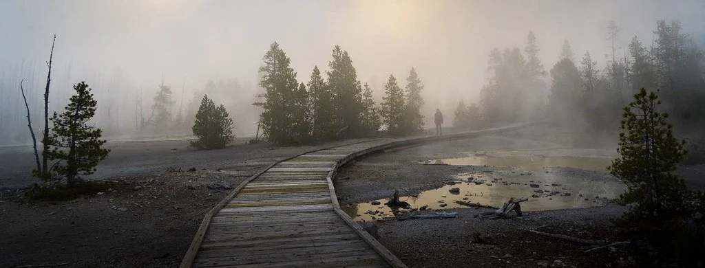
This photo, taken at Norris Geyser Basin in Yellowstone National Park, is a great example of the power contrast can have on an image.
Firstly, it creates meaning within your shots. When your mind sees two oppositional elements, the viewer is forced to compare and contrast them. This gives each element a sound definition, which allows us to better understand what the image is saying.
Second, contrast builds excitement in your photography. When you have two opposing forces next to each other, it creates a source of tension that is interesting. Notice how you always see people talking about drama or gossip? The same concept applies to nature. If you see opposing elements interacting, it creates that drama people crave.
Thirdly, and most importantly, contrast determines where your subject is in a photo. In other words, contrast has the power to create a subject completely from scratch. As you will see in the following examples, wherever the subject is located, that is also where the contrast is.
Now that we understand the importance of contrast, let's dive into how we can use it.
How to Use Contrast in Photography
Contrast can be used in every single Element of Design. I’m going to run down the line and show you how it can be used with each one.
Lines
Let’s start with the most basic Element of Design, Lines. The first way you can use contrast with lines is by making them intersect. This can be done perpendicularly, or randomly. Check out this image right here, for example:
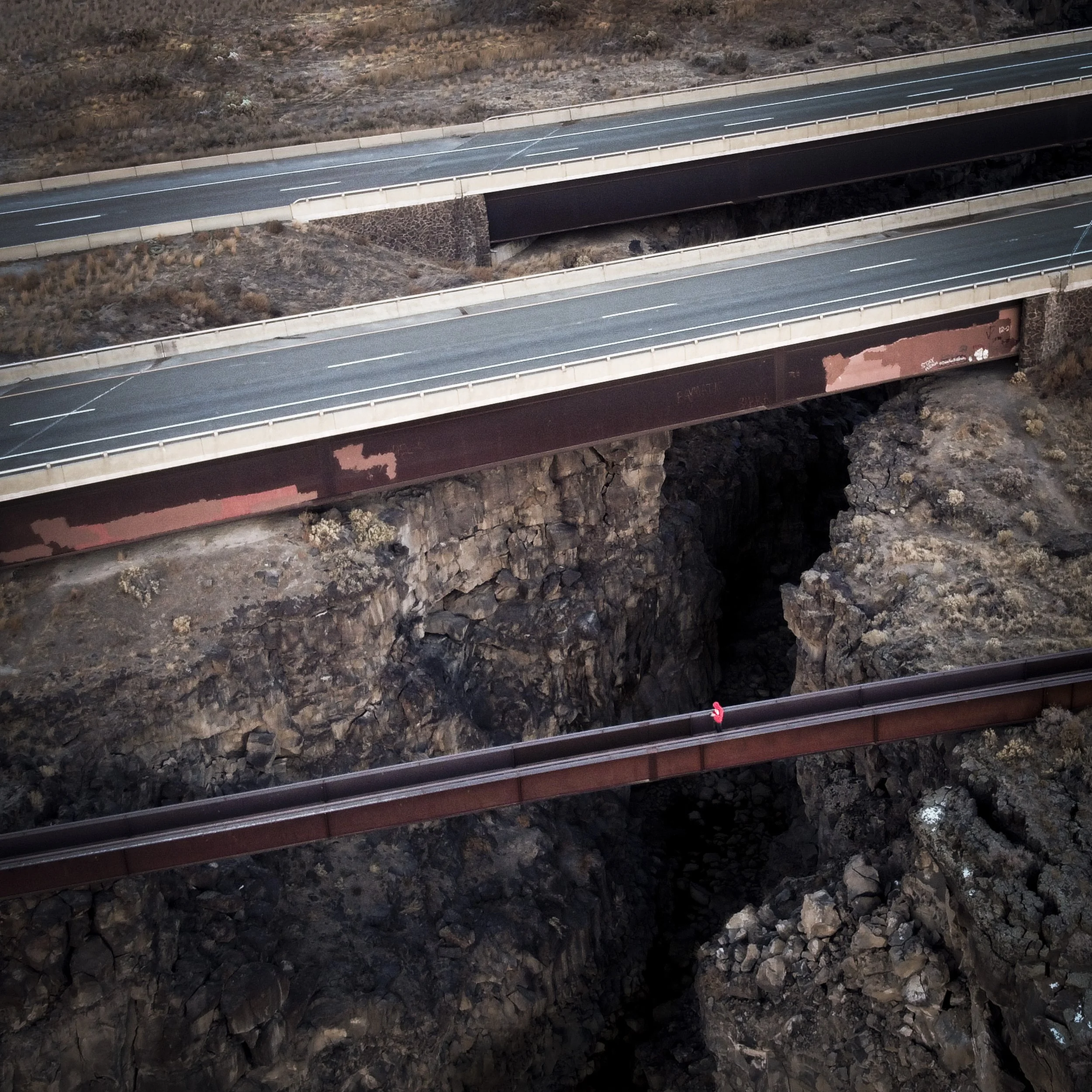
This photo, demonstrating opposing lines, was taken at Thousand Springs State Park in Idaho.
You can see a highway overpass and bridge going in one direction, and in the other direction there is a huge canyon leading down into darkness. We have these two opposing forces contrasting each other through different directions of lines.
This creates a visual metaphor: nature, represented by the cavern, versus the man-made highway going over the top of it. In this case, man was able to conquer nature and build a solution to get across.
Another way you can use lines with contrast is with frequency. In this photo, for example, we see the larger lines forming the foundation of a pyramid in Guatemala, contrasted with the smaller, more frequent lines of the staircase:
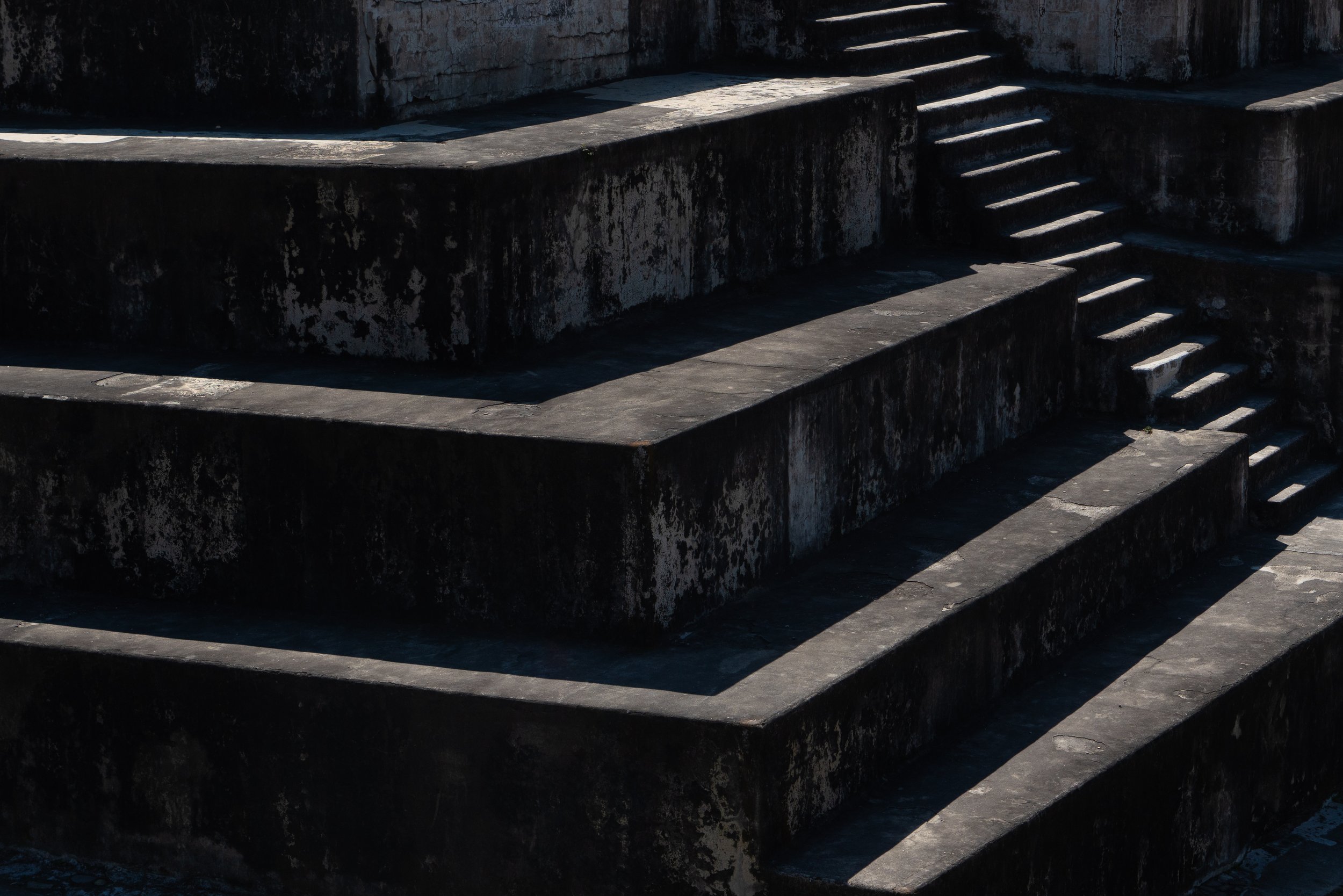
This photo, representing frequent lines used for contrast, was taken at Archeological Park Zaculeu in Guatemala.
This contrast tells a story for the viewer. The staircase is where people walk, while the blocks are the foundation that holds up the pyramid.
One final way to use contrast with lines is through the type of line. For example, in this shot, we see a man-made path leading up to a small house, while in the distance a river creates another line:

This photo, representing how lines can connect two concepts (man and nature,) was taken at Theodore Roosevelt National Park in North Dakota.
One is man-made and the other is natural. This image connects two contrasting lines to symbolize a connection between man and nature. Notice how this is the opposite of the first example, where the lines were contradictory.
Contrast, then, can be used to show either opposition or harmony. And here’s a fun fact: the building in this image was actually designed so that the path would visually connect with the river to form an S-shape. This Principle of Art applies not just to photography, but also to architecture and landscape design.
Shapes
Let’s move onto the next Element of Design, Shapes. Using shapes with contrast is a bit more obvious, but let me break it down for you. Check out this example of church ceiling:

This photo, demonstrating the contrast of shapes, was taken at the International Church of Cannabis in Colorado.
The interesting thing about this church is that it was built around the idea that cannabis is a sacred sacrament. By displaying all those wild shapes on the ceiling, the design conveys a sense of chaos and hallucination. These contrasting shapes help tell us the story that cannabis can, in the church’s view, mend the chaos of the world.
Form
Now let’s take a look at how Form can be used with contrast. Remember that form is essentially adding a third dimension to shapes! It is also one of the more difficult Elements of Design to work with contrast, but it can be done. The idea is to contrast something that feels three-dimensional against something that feels two-dimensional.
Let’s look at this photo, for example:

This photo, representing contrast of form, was taken at Pfieffer Beach in Calfiornia.
Notice how there is a cliff in the background, with two people standing on it in the top left. But in the bottom right, there is a hole in the cliff with ocean water flowing through it. This section creates a diagonal in the composition, which gives the water a 3D element. When contrasted with the silhouetted 2D people in the top left, the image pops.
Color
Contrast of Color is most obviously shown with the color wheel. For example, in this photo, a red leaf stands out against green moss:
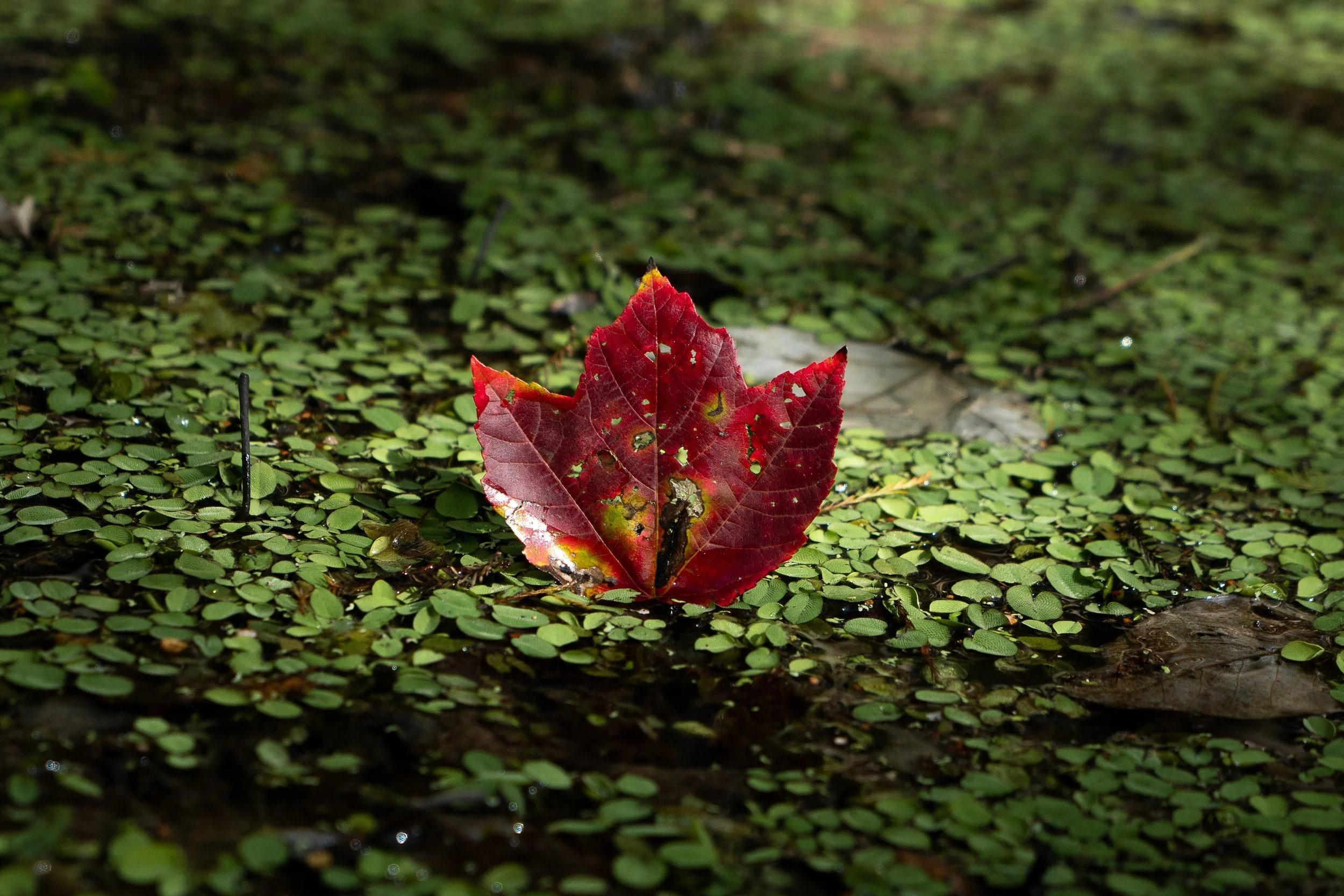
This photo, representing contrast of color, was taken at Chicot State Park in Louisiana.
Red and green are complementary colors, so they contrast beautifully and immediately draw attention to the subject.
Color contrast can also be created through saturation. One of my favorite techniques is to give the subject of the image more saturation than the rest of the image. This can be achieved through post-processing techniques we’ll cover later in this course.
For instance, check out this photo:
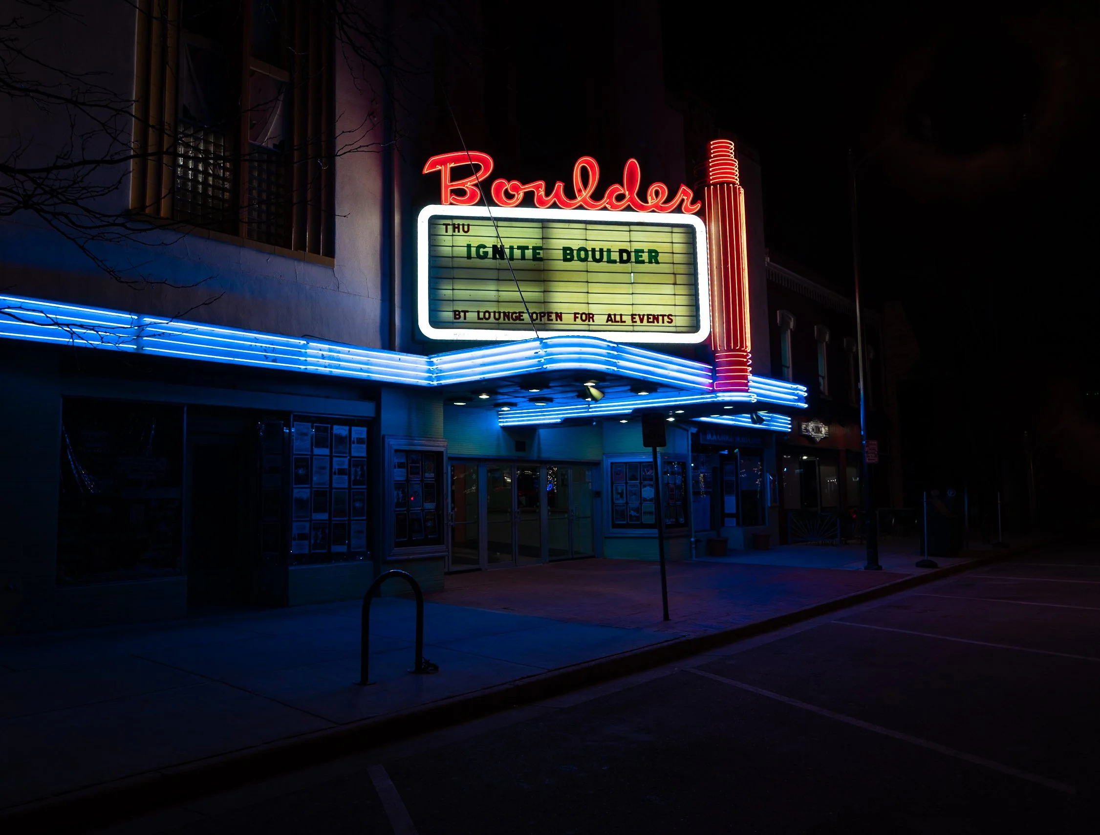
This photo, demonstrating how color saturation can draw the eye, was taken in Boulder, Colorado.
The glowing neon colors dominate the frame, giving it a cyberpunk or Blade Runner type of feel. The rest of the shot is shrouded in darkness and desaturation.
At the other end of the spectrum, you can use saturation more subtly:
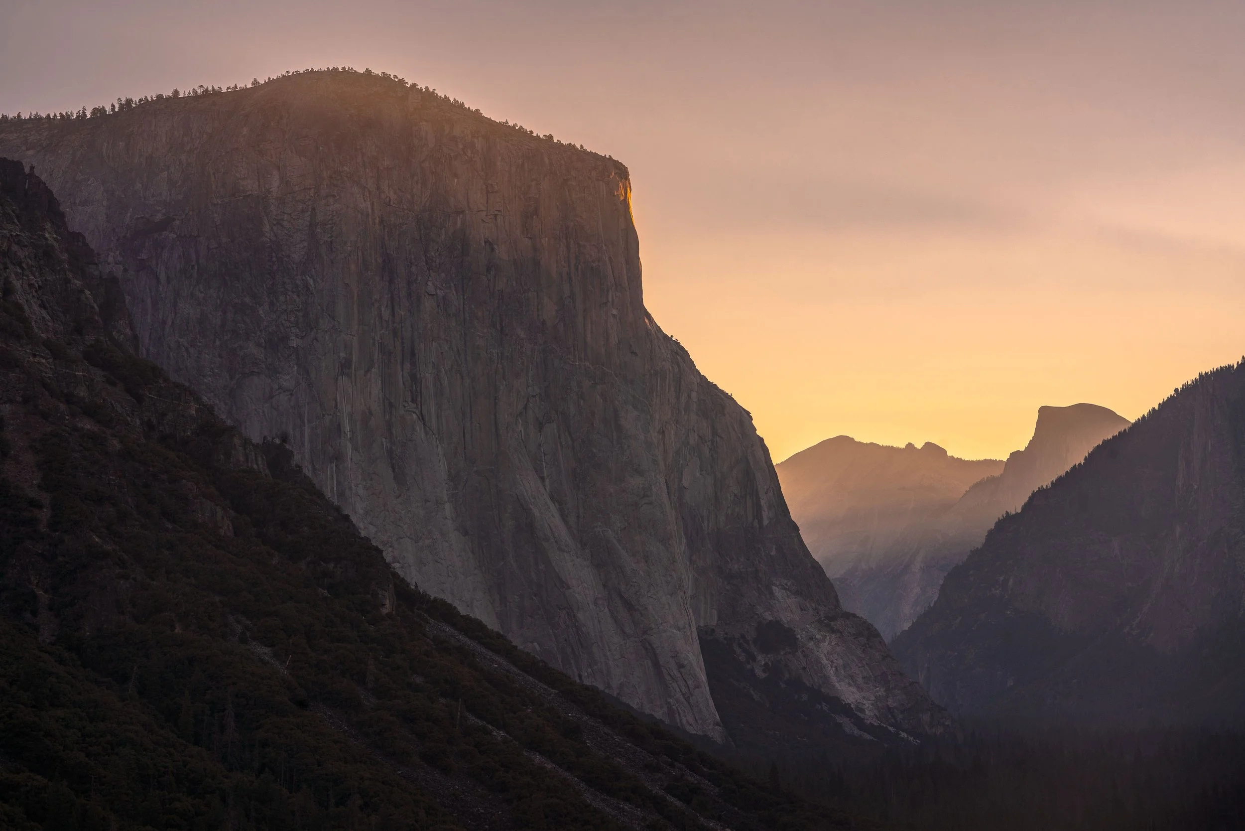
This photo, again representing how saturation can draw the eye, was taken at Tunnel View in Yosemite National Park.
In this shot of El Capitan in Yosemite, the peak is hit by sunlight, making it the most saturated and vibrant part of the image. Desaturating the rest of the image helps the viewer’s eye naturally focus on that peak.
Texture
Now let’s look at Texture. Contrast in texture is all about creating opposing feelings of “touch” in an image. For example, check out this photo:
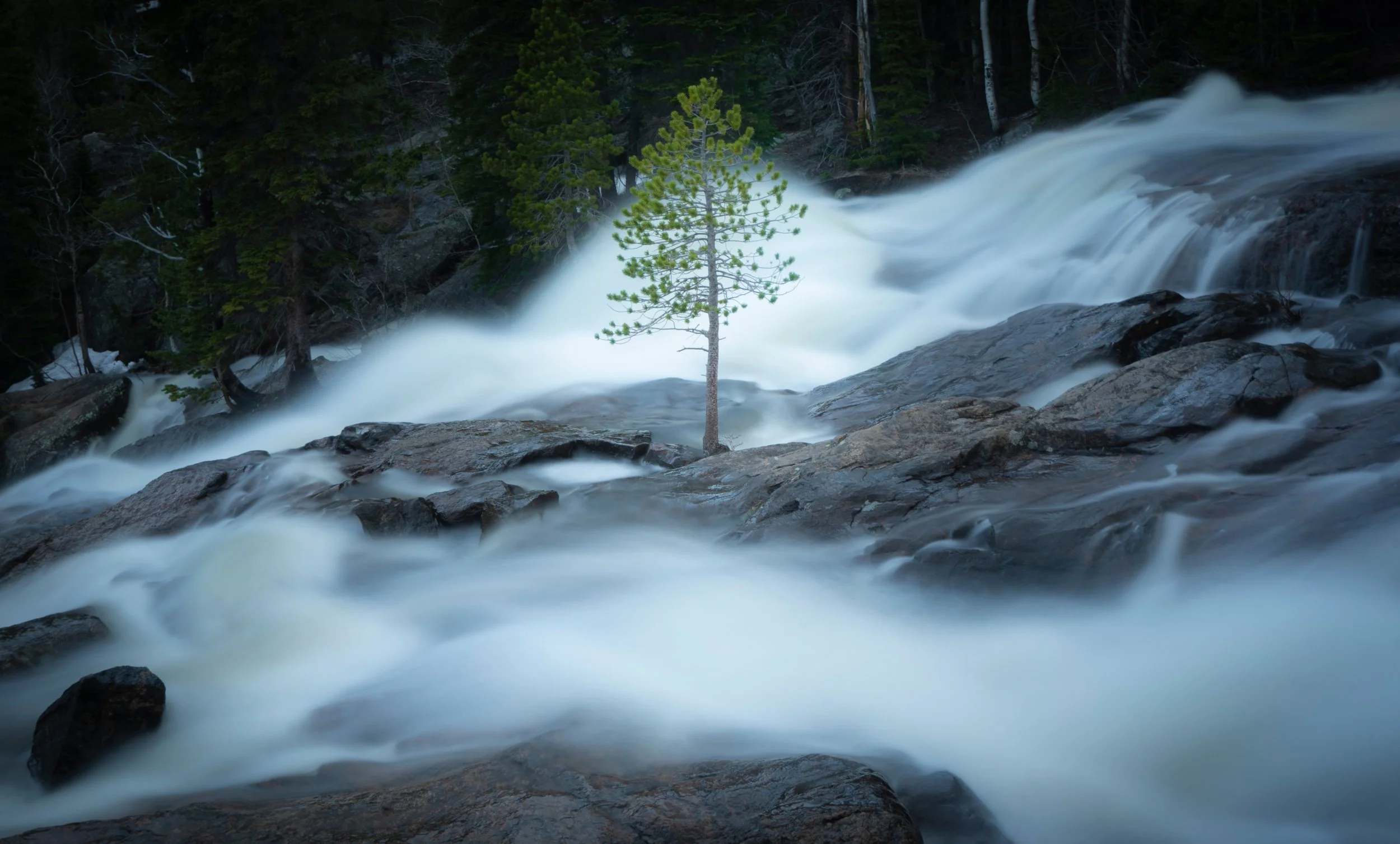
This photo, representing contrast of texture, was taken at Rocky Mountain National Park in Colorado.
I used a long exposure to make the water look silky and smooth, but in the middle of the frame, there is a sharp, prickly pine tree. The contrast between the smooth water and spiky tree pulls the entire shot together. Not to mention the fact that the tree is essentially silhouetted by the immense flow of water, utilizing contrast of color as well.
Another way to create contrast in texture is by intentionally putting your subject out of focus, which goes against traditional photography rules. For example, in this shot, I’m lying on a hammock in the background, but the tree and blade of grass in the foreground are sharp and in-focus:
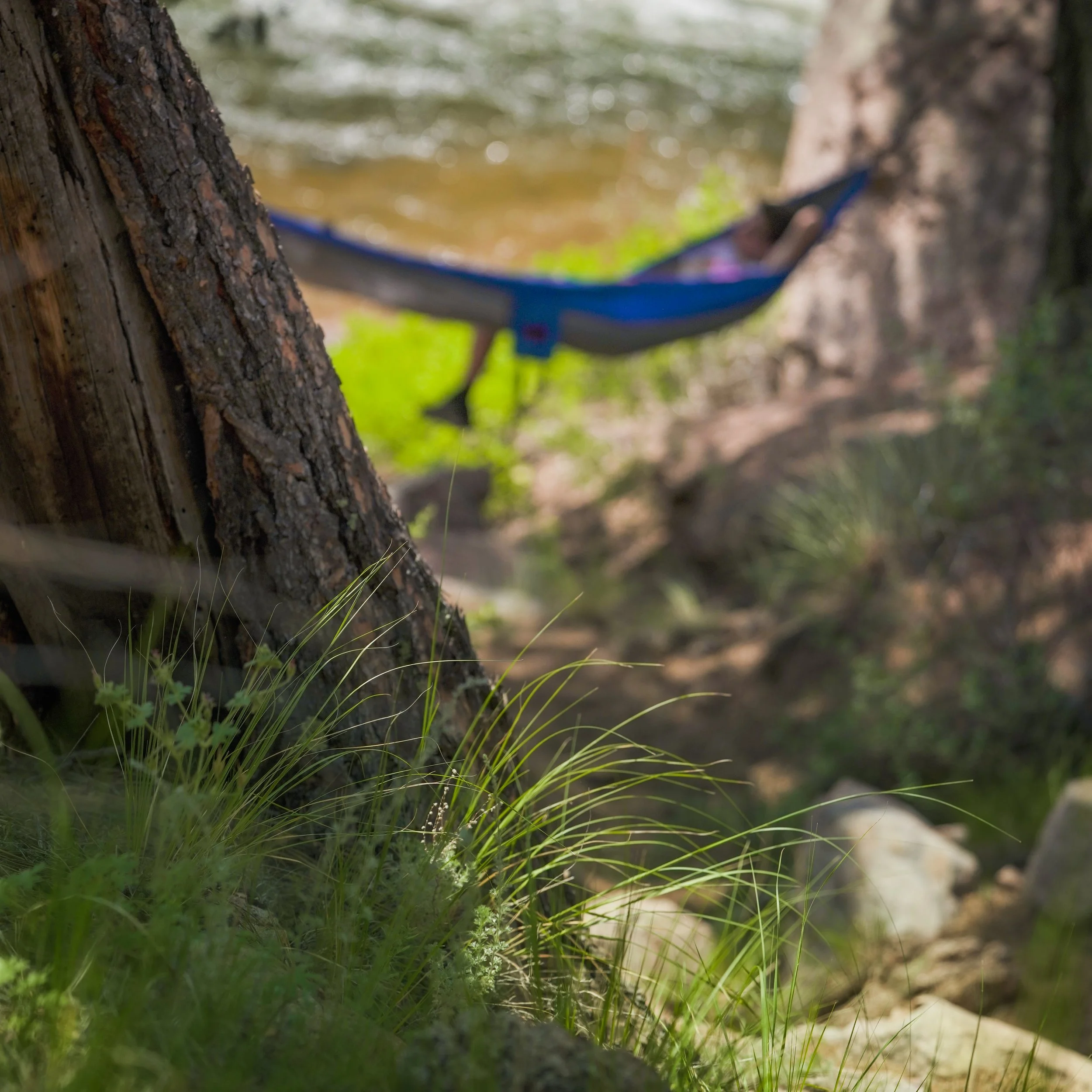
This photo, demonstrating contrast of sharp versus soft texture, was taken at Cheeman Canyon in Colorado.
The soft background suggests calm and tranquility, contrasted with the crisp, natural textures of the grass.
You can even do this with people. In this photo, a girl is clearly the subject, but I chose to focus on the distant island instead, creating a surreal and abstract feeling:
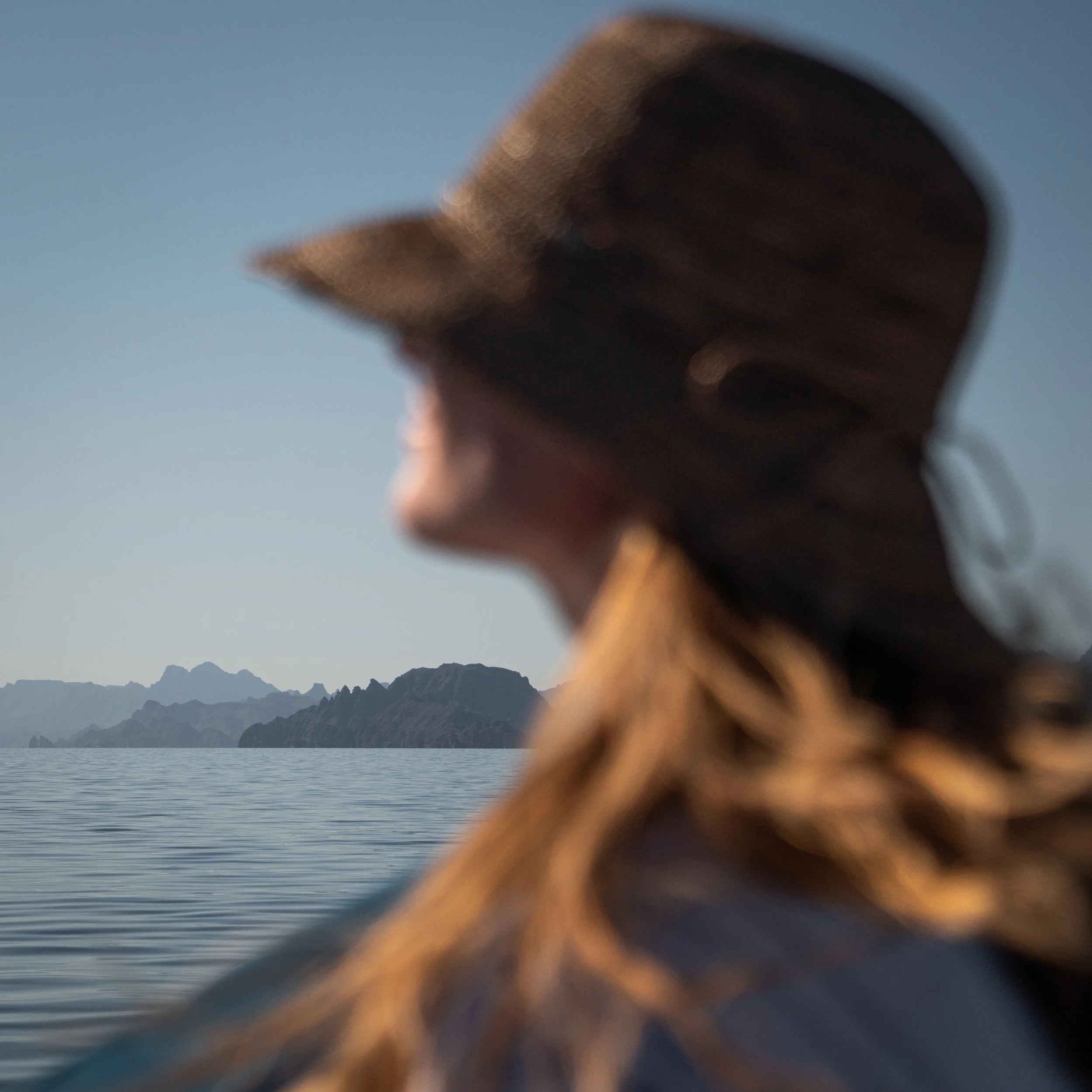
This photo, demonstrating how aperture can be used to create contrast of texture, was taken at Bahía de Loreto in Mexico.
If you ever feel bored of shooting the same thing, try putting your subject out of focus and see what kind of tension it creates.
Value
Value refers to the lightness and darkness of an image. Contrast in value is one of the most powerful tools in photography. One common way to use it is with silhouettes:

This photo, representing contrast of value, was taken in Broomfield Open Space, Colorado.
Notice how the subject is silhouetted against the bright light outside, creating a dramatic, James Bond–like feel. But contrast in light doesn’t always need to be harsh. In this photo, a bird flies across the sun:

This photo, representing a more subtle version of value contrast, was taken at Glass Beach in California.
The sun isn’t pure white, and there are still other colors present, but the brightness is enough to make the bird stand out.
The main idea is here that the eye is always drawn to the brightest area of an image. For example, in this drone shot of sea stacks, one rock is completely covered in white bird droppings, making it the first place the eye goes:

This photo, representing how bird dropping can make a subject stand out, was taken at Smuggler’s Cave in Colorado.
Other nearby rocks without the white blended in with the ocean, and wouldn’t work quite as well as subjects.
However, there is one exception to this rule: pure black. If an image contains an area of true black, the eye will naturally be drawn there, as pure black is rare in nature. Normally, you want to avoid absolute black points, but they can be used creatively if you want to direct attention.
Space
Finally, let’s talk about space. The most obvious type of contrast here is positive versus negative spaces. For example, in this photo taken at a geyser in Yosemite, I am silhouetted against white steam while a dark forest fills the background:
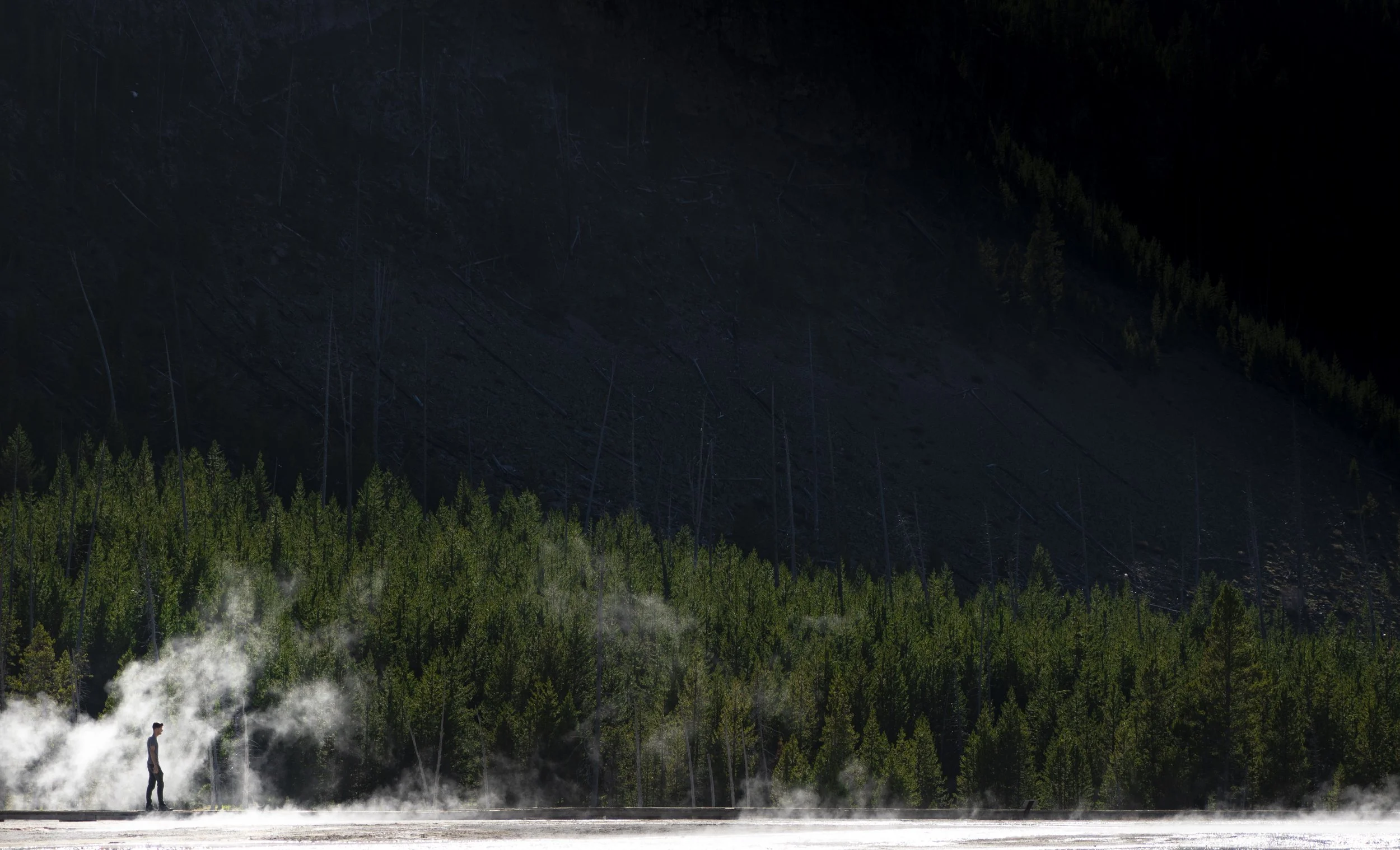
This photo, representing contrast of space, was taken at Geyser Basin in Yellowstone National Park.
The balance of positive and negative space creates a natural contrast. If the steam wasn’t there, I’d blend right into the trees.
Another example is this photo of a forest with an airplane in the middle:

This photo, representing how space can be used to display contrast, was taken at the infamous Airplane Home in Oregon.
Here, contrast is not only visual but also conceptual: man versus nature. (Notice how this theme seems to permeate landscape photography so often?) Contrast makes it easy to symbolize big themes.
Conclusion
In summary, if you have something you want to make the subject of your photo, ask yourself how you can contrast it with the environment. This will make it stand out more, and give that subject power.
Sometimes you also have to accept that the subject you want might not be the best fit for a certain scene. In a lot of ways, finding contrast is like looking for light- it’s not always going to be where you want it, but it’s up to you to figure out how to make it look beautiful.
So move around, isolate it, and create tension using the Elements of Design. You’ll get better with practice! Let’s jump into the next tutorial, where I’m going to discuss Patterns!