
How Harmony Controls Your Photography
Learn about the 7th Principal of Design- Harmony. I break down what it is, and cover 7 visual tangents that can destroy the harmony in your image.
Prefer to watch this tutorial in video format? 😏
Introduction to Harmony
In this tutorial, I'm going to walk you through the seventh and final Principle of Art, which is harmony. I'll explain what harmony is, show you a few examples, and then walk you through seven visual tangents that can disrupt the harmony within your image.
Let’s get started!
What is Harmony?
Harmony is the most subjective principle of art. It's all about following your gut feeling towards what looks good, or what many call the “photographer's eye.” It involves balancing all the elements of design and principles we've discussed so far in a way that is visually appealing, and creating a sense that nothing in the shot is out of place.
With that said, let me show you three examples of harmonious images from my perspective. The first example is this shot of a tree taken on a beach in Washington:
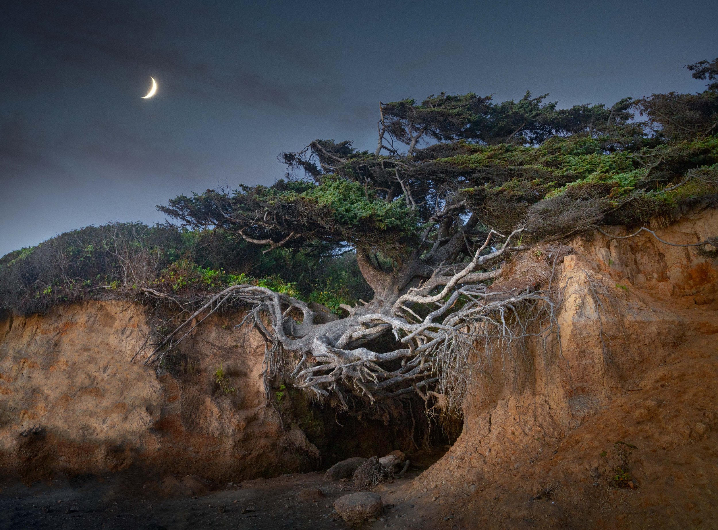
This photo, which is a prime example of visual harmony, was taken at the Tree of Life in Washington.
In my opinion, the harmonious aspects are the moon on this creepy night and the roots with a spiderweb-like effect. The tree appears to be struggling, giving the entire image a creepy, unsettling vibe. This creates harmony within the theme of horror.
On the opposite end of the spectrum, check out this image of a sunset beach in Nicaragua:
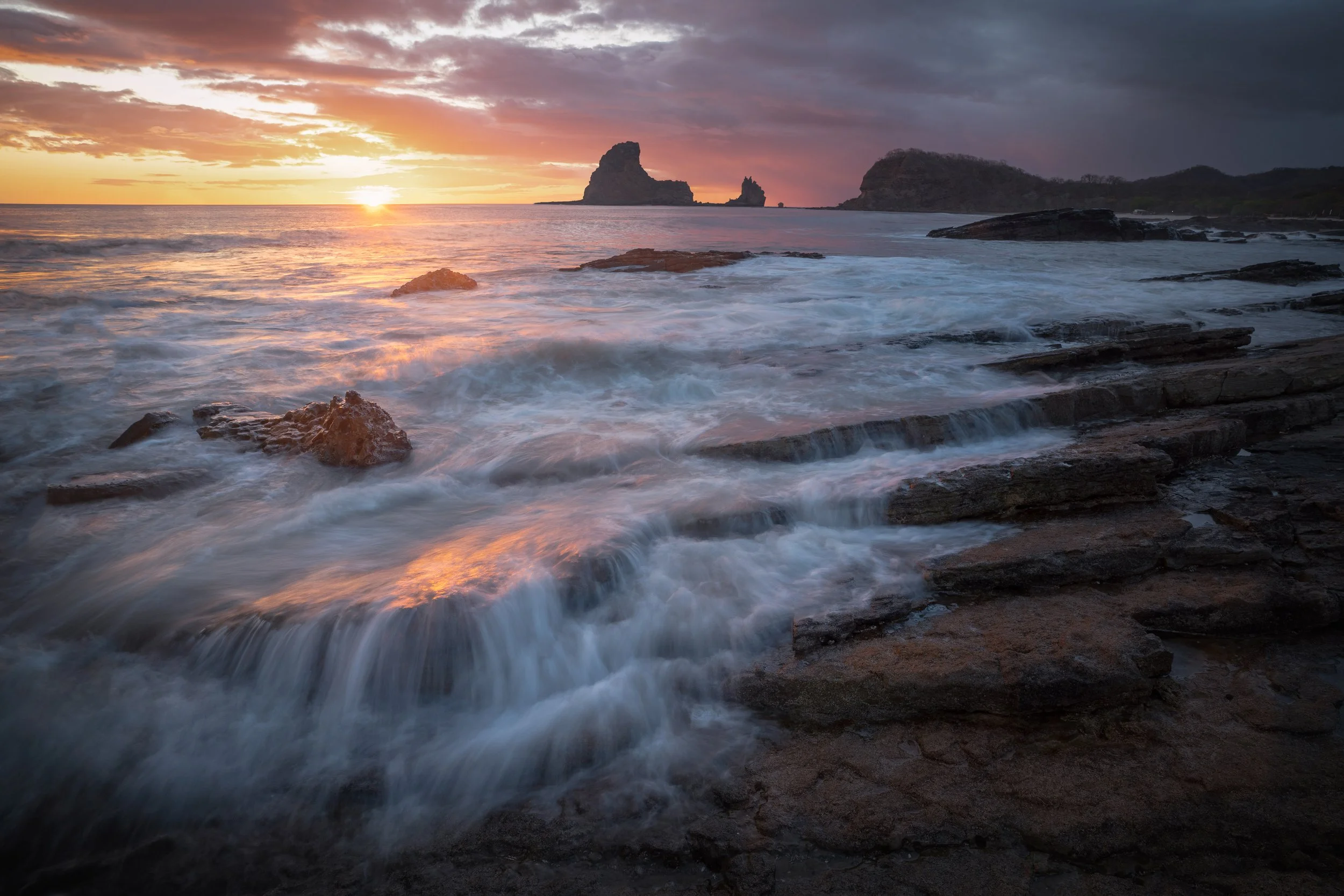
This image, which also demonstrates visual harmony, was taken on Playa Maderas in Nicaragua.
We have a smooth staircase of rocks with water flowing off them, a reflection of the beautiful sky in the water, and a moody backdrop. The whole image has a tranquil harmony. The lesson here is that harmony can be achieved within different themes: a horror-esque vibe in the first image, and a tranquil beach sunset in the second one.
Let’s go over one more type of harmony- a blend between mankind and nature:

This image, representing a harmonious relationship between man and nature was taken at Isla Aguada in Mexico.
The man-made boat is complemented by birds perched on it, adding a sense of nature to the shot. Fun fact: this shot is a double-exposure time blend. I took one shot of the still water and another of the birds, which were jumping around and tweeting. I used a high shutter speed for the birds and blended the two images in Photoshop.
This image took a couple of hours to edit, but I felt like it was worth it for the rare harmonious blend. The main lesson here is that harmony is subjective, and not everyone will agree on what it means- but trust your instincts.
Visual Tangents
Now, let's talk about visual tangents. Since harmony lacks a technical process for constructing it, this tutorial is a great opportunity to discuss elements that can destroy your harmony. Visual tangents are small compositional elements that can throw off the entire image if you're not careful.
I’m going to run through seven tangents to look out for. Let’s begin.
Closed Corners
The first visual tangent I want to cover is called closed corners. This occurs when a corner of the shot is closed off, usually by a single outlier color, texture, or pattern that draws the eye unnecessarily. For example, in this image I took a couple of years ago, the bottom left corner is cut off from the tranquility of the rest of the scene.

This image, representing the visual tangent of closed corners, was taken at Bruneau Dunes State Park in Idaho.
Other than this corner, it's a fantastic photo. But unfortunately, the eye gets sucked into that corner purely because it’s blank. If I were to redo this shot, I'd angle my camera a few feet to the right to close off that corner, or I’d find a secondary subject, like a plant for example, to balance the shot out.
Now you may be thinking, could the closed corner align with a proportion rule like the golden triangles? If you remember, the golden triangles symmetrically divide an image into triangles.
Unfortunately, the answer to this question is no. Images like this lack balance because the diagonal line isn't halfway through the shot like the golden triangle rule dictates; it's arbitrarily placed. The solution here is to avoid closed corners altogether. If you must include one, soften, darken, or desaturate it to keep the eye from being drawn there.
Halved Shapes
The second visual tangent on our list is called halved shapes. This essentially means that you should avoid cutting a primary subject in half. For example, in this image of leaves on top of a larger leaf, the larger leaf is cut right down the side, making it look unbalanced and unappealing:

This image, representing the visual tangent of halved shapes, was taken at Zona Arqueológica Palenque in Mexico.
If we crop it differently, ensuring the entire leaf is in the frame with space around the edges, it looks much more balanced and wholesome:

Here is the corrected version of the image of the shot taken at Zona Arqueológica Palenque in Mexico.
Avoid cutting primary subjects in half to make a world of difference in your photography.
Fused Edges
The next visual tangent is called fused edges. This occurs when a primary or secondary subject touches the crop corners of the shot. For example, in this image, the Hollywood sign rests on the bottom crop, and palm trees in the top right touch the corners:
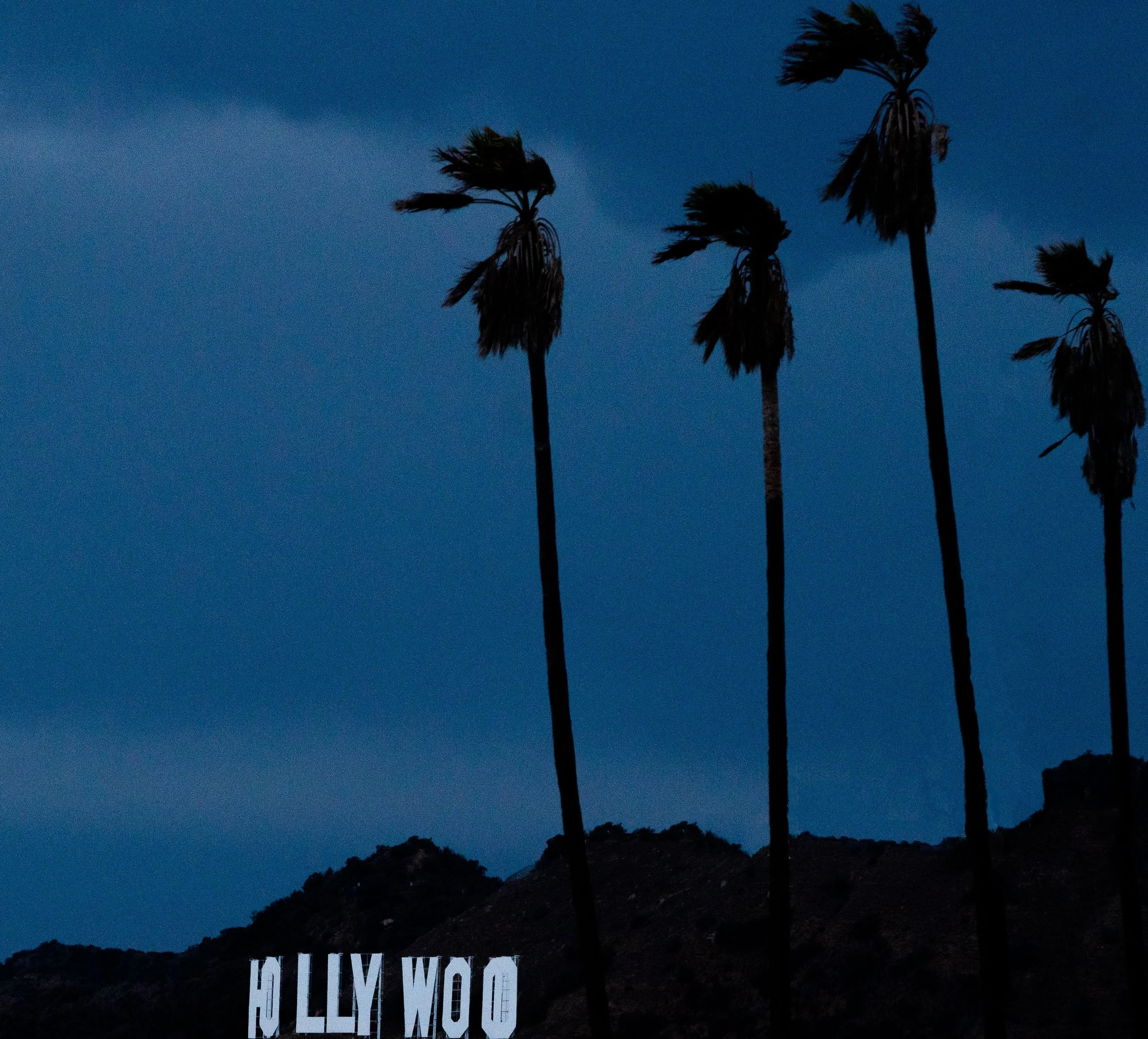
This image, representing the visual tangent of fused edges, was taken at Griffith Park in California.
This makes the entire image feel claustrophobic. Never crop right along a subject line; give subjects space to breathe. In this properly cropped version, the subjects have room, and the shot looks much more harmonious:

Here’s the corrected version of the shot taken at Griffith Park in California.
Fused Edges with Shapes
The next visual tangent is fused edges with shapes. Instead of a subject touching the edge of the shot, you have primary or secondary subjects touching each other. For example, in this image, I'm standing in the center of a waterfall (the first shape), and the rocks (the second shape) are right next to me, touching:

This shot, taken at Proxy Falls in Oregon, suffers from fused edges with shapes.
This doesn't work well because I'm directly touching the rocks. Ideally, I'd be positioned about two feet to the right, silhouetted in the white stream of water, separating myself from the triangular mossy rocks to the left.
Split Apex
Now let’s talk about a split apex. This visual tangent occurs when two vertical lines of different subjects align on top of each other. For example, in this shot taken on a prairie in Colorado, I avoided this tangent:

This photo, taken at Peace Valley School in Colorado, avoids falling into the pitfall of a split apex visual tangent.
If the tree aligned directly with the pole below it, creating a solid line, it would produce unnecessary symmetry, causing a distracting optical illusion that's unsettling to the viewer. Avoid a split apex when you see it, even though it can be tempting to align it up.
Stolen Edge
The next visual tangent is called a stolen edge, which is similar to fused edges within shapes. Except now the two touching lines create one solid line, making two shapes share the same edge. This creates another tricky optical illusion. In this shot, two trees are fused along their lines, making the image feel uncomfortable:

This shot, taken at Shrine Pass in Colorado, has fused edges with the two trees.
I took this shot early in my career, so I don't have a fixed version, but if I could go back, I'd move the camera to the right to have the trees jut in different directions for better balance.
Antlers
The final visual tangent I want to cover is called antlers. This is a subtle tangent that often goes unnoticed. It occurs when a single subject in your shot has tree branches, poles, or other elements forming a V shape over it, acting like an unnecessary arrow.
In this shot taken at a waterfall in Mexico, an otherwise harmonious image is disrupted by tree branches creating a V shape over the central plant:

This photo, which contains a subtle antler tangent, was taken at Cascada de Micos in Mexico.
I tried darkening the antlers to reduce their value, but they're still noticeable every time I look at the image. Keep an eye on the background for weirdly shaped trees or similar elements.
Conclusion to Harmony
In the end, harmony is a highly subjective Principle of Art that’s achieved by trusting your gut. What themes correlate well together, and what makes an image feel “complete” to you? The more time you spend looking at highly regarded photographers, the more you’ll be able to develop this instinct.
In addition to “feeling the vibe,” pay attention to all the visual tangents I covered in this tutorial. They are subtle disruptions that can ruin the harmony in an image.
And that, my friends, concludes our section on the Principles of Art! In the next tutorial I’m going to go over Storytelling, and how to use it within your photography.